Wednesday, July 30, 2008

range graded proportional map


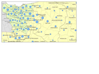
A range graded proportional map is one that uses the size of circles on a map to show the grade of a variable. The bigger the circle the higher the grade. It is different that a proportional circles map because only a certain range of circles are used. This is where I found the image.

Univariate map


A univariate map is one that only shows one set of data. In the map above it is showing income as the one variable. This is where I found the image.

unstandardized chloropleth map


Unstandardized chloropleth maps are unranked. There is not one unit that is higher than another. In this way it is a type of nominal area chloropleth map because nominal data is naturally unordered. This is where I found the image.

nominal area chloropleth map


A nominal area chloropleth map is a chloropleth map that displays nominal data. Here is where I found the image.

Bivariate map


A bivariate map displays two variables on a single map by combining two different sets of graphic symbols or colors. Here is where I found the image.

Tuesday, July 29, 2008

Population profile


A population profile is a graph showing population over time. This is where I got the image.

Lorenze graph


A Lorenze graph is a graph for showing the concentration of ownership of economic quantities such as wealth and income; it is formed by plotting the cumulative distribution of the amount of the variable concerned against the cumulative frequency distribution of the individuals possessing the amount. I found the image at: ( http://content.answers.com/main/content/img/oxford/Oxford_Geography/0198606737.lorenz-curve.1.jpg).

Bilateral graph


A bilateral graph is one that has two sets of data graphed together. A climograph is a type of bilateral graph. Thus is where I got the image: http://www.globalhumanitarianassistance.org/New%20Images/Growth%20in%20bilateral%20humanitarian%20assistance%202005-2006%20copy.jpg

Pie chart


A pie chart is a graphical interpretation of data. It usually shows percentages of different options. This is where I found the image.

Pictograph


A pictograph is a type of graph or map that uses images to show the amount of data. For example if a car company wanted to show their sales they would show a bigger car for more sales and a smaller car for less sales. This is where I found the image.

Black and white photography


Black and white photography was the first type of photography available. It continued in popularity even after color photography was available. This is where I found the image.

Infrared photography


In infrared photography, the film or image sensor used is sensitive to infrared light. The part of the spectrum used is referred to as near-infrared to distinguish it from far-infrared, which is the domain of thermal imaging. I found the image here: http://www.fas.org/irp/imint/docs/rst/Sect10/originals/Fig10_7.gif

Cartographic animation


A cartographic animation is a map that is interactive or animated in some form to more thoroughly convey the information. This is an unanimated version. The directions are included on the image though.

Dot distribution map


A dot distribution map is a map that shows the frequency and location of certain things. For example there could be a dot distribution showing a dot on all the springs in Florida. This is where I found the image: http://www.botany.wisc.edu/Wislichens/dots/PELRUF.gif

Wednesday, July 23, 2008

Distance matrix


A distance matrix is a 2D matrix containing the distance of a set of points. This is where I found the image.

Similarity matrix


A similarity matrix is a matrix of scores which express the similarity between two data points. This is where I found my image.

Parallel coordinate


A parallel coordinate graph is used to plot large datasets with multiple variables. Each of the different datasets is represented by its own y-axis and they all have a common x-axis. Here is where I found the image.

Triangle plot


A triangle plot graphs three variables- one on each side of the triangle. Here is where I found my image.

Windrose


On a wind rose the length of the vectors shows the percentage of time the wind blew in that direction. This is where I found my image: http://www.climate.washington.edu/windrose/Seattle-WindRose.jpg

Climograph


A climograph is a graphical depiction of the monthly or yearly precipitation and temperature conditions for a location. This is where I found my image.

DOQQ


A DOQQ is a Digital Orthophoto Quarter Quadrangle. It is a one meter pixel resolution at a 1:12,000 scale. Most of the US is available in DOQQ. It is an aerial photo that has been corrected so it can read as a map. This is where I got my info and image: http://www.personal.psu.edu/mtc5031/project3pic3.jpg

DEM


A DEM or a digital elevation model is a digital display of surface terrain. They are usually created using remote sensing. I got my information and my image here.

Wednesday, July 16, 2008

DLG


A DLG- digital line graph, is a digital vector representation of other maps and depending on the map has different layers added in. I found my map here.

DRG


A DRG- digital raster graphic, is a scanned image of a USGS topography map. Here is my map.

Isopleth


An isopleths is a curved line that connects points of equal value, the smaller subsets include things like isohyets and isotachs. I found an image here: http://dstreme.comet.ucar.edu/images/sfc_pres.gif

Isohyets


Isohyets are lines on a map connecting point that receive the same participation. I found my map here: http://www.soil.pir.sa.gov.au/images/cep_rep_fig2a_pg22.gif

Isotachs


Isotachs are lines on a map connecting points of the same wind speed. I found my map here.

Friday, July 11, 2008

infared aerial


An Infrared Aerial photo uses film(or digital technology in a digital camera) that is sensitive to infrared light. It reflects light on different substances in different ways so the image doesn’t look like a typical photo. This is where I found the image: http://www.onlakepartners.org/gif/p1101d.gif

statistical map


A statistical map is a broad category that contains maps like chloropleth maps and proportional circle maps. They display statistical data in map form. Here is the site.

cartogram


A cartogram is a map in which a mapping variable is substituted for land area. It distorts the shape of the map to make up for the data. Here is the map site.

flow map


A flow map is a map that shows the movement of people or things in an area. An example would be migration patterns of animals. Here is the site.

Isoline map


An Isoline map is a map of continuous lines that join points of the same value. Isobars and isopleths are all subsets of isoline maps. This is where I found it.

Proportional Circle


A Proportional Circle map is one that uses different sized circles to show data. An example would be different sized circles for population. This is where I found a map.

Chloroleth Map


A Choropleth Map is a type of thematic map. They are shaded and patterned in the proportion to the statistical variable being displayed. The statistical data is layed over region boundaries. I found my example here.

Tuesday, July 8, 2008

propoganda map


A propaganda map is used to popularize and idea. It is a map that is presented in a way to convey a desired meaning to the viewer. In this map, the idea is to show the leaching effect of Germany. Nazi Germany is black to show its evil power. Its allies another color, and the places it’s taken over another color. The unconcerned countries have expected dates to be concurred and the seas are relabeled “German”. The title and message of the map speak for itself. The map maker wanted to spread fear.

hypsometric map


A hypsometric map is a further classification of a topographic map. It gives elevation by countouring, shading, and coloring. Where a topographic map only has to show elevation, a hypsometric has to show the contours using shading and colors. This is where I found this image.

PLSS map


PLSS is the Public Land Survey System. The system divides federal land into 6 mile square townships, these can be divided further to 36 one mile square section which can further be divided to quarter sections, and quarter quarter section, etc. Here is where I found my map.

Cadastral map


Cadastral maps show the land boundaries and ownership of individual parcels. An simple example would be showing the states of the U.S. each boundary shows a different parcel and ownership. Here is where I found a map. It shows the parceling of land in a town.

thematic map


A thematic map shows the distinction between different regions based on a set of data being compared. In this map the water use in the different states is the theme being compared. It is shown by the gradation of color. The map isn’t concerned with roads, cities, or mountain ranges; only the state boundaries and the color delineating the amount of water consumed by that state. Here is where I found the map.

topographic map


A topographic map is the opposite of a planimetric map. It shows elevation as the focus of the map. It shows contouring of different slopes. This is where I found my topographic map.

planimetric map


A planimetric map shows the horizontal representation of features and doesn’t give regard to elevation. This is the opposite of a topographic map and it is how we think of maps in the traditional sense. I found my image and definition here.

mental map


A mental map can’t be fully realized by an image. It is more abstract. A mental map is the idea and map that each of us has in our minds of different places. For me one map might be how many steps I have to take to get from the bathroom to my bed at night so I can do it while half asleep and in the dark without stubbing my toes. It is what are brain creates daily in all different environments to store for later use. I attached my mental map of this the best as I can draw it on paint.