Wednesday, July 30, 2008

range graded proportional map


A range graded proportional map is one that uses the size of circles on a map to show the grade of a variable. The bigger the circle the higher the grade. It is different that a proportional circles map because only a certain range of circles are used. This is where I found the image.

Univariate map


A univariate map is one that only shows one set of data. In the map above it is showing income as the one variable. This is where I found the image.

unstandardized chloropleth map


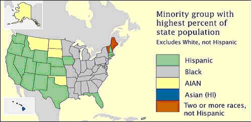
Unstandardized chloropleth maps are unranked. There is not one unit that is higher than another. In this way it is a type of nominal area chloropleth map because nominal data is naturally unordered. This is where I found the image.

nominal area chloropleth map


A nominal area chloropleth map is a chloropleth map that displays nominal data. Here is where I found the image.

Bivariate map


A bivariate map displays two variables on a single map by combining two different sets of graphic symbols or colors. Here is where I found the image.

Tuesday, July 29, 2008

Population profile


A population profile is a graph showing population over time. This is where I got the image.

Lorenze graph


A Lorenze graph is a graph for showing the concentration of ownership of economic quantities such as wealth and income; it is formed by plotting the cumulative distribution of the amount of the variable concerned against the cumulative frequency distribution of the individuals possessing the amount. I found the image at: ( http://content.answers.com/main/content/img/oxford/Oxford_Geography/0198606737.lorenz-curve.1.jpg).

Bilateral graph


A bilateral graph is one that has two sets of data graphed together. A climograph is a type of bilateral graph. Thus is where I got the image: http://www.globalhumanitarianassistance.org/New%20Images/Growth%20in%20bilateral%20humanitarian%20assistance%202005-2006%20copy.jpg

Pie chart


A pie chart is a graphical interpretation of data. It usually shows percentages of different options. This is where I found the image.

Pictograph


A pictograph is a type of graph or map that uses images to show the amount of data. For example if a car company wanted to show their sales they would show a bigger car for more sales and a smaller car for less sales. This is where I found the image.

Black and white photography


Black and white photography was the first type of photography available. It continued in popularity even after color photography was available. This is where I found the image.

Infrared photography


In infrared photography, the film or image sensor used is sensitive to infrared light. The part of the spectrum used is referred to as near-infrared to distinguish it from far-infrared, which is the domain of thermal imaging. I found the image here: http://www.fas.org/irp/imint/docs/rst/Sect10/originals/Fig10_7.gif

Cartographic animation


A cartographic animation is a map that is interactive or animated in some form to more thoroughly convey the information. This is an unanimated version. The directions are included on the image though.

Dot distribution map


A dot distribution map is a map that shows the frequency and location of certain things. For example there could be a dot distribution showing a dot on all the springs in Florida. This is where I found the image: http://www.botany.wisc.edu/Wislichens/dots/PELRUF.gif

Wednesday, July 23, 2008

Distance matrix


A distance matrix is a 2D matrix containing the distance of a set of points. This is where I found the image.

Similarity matrix


A similarity matrix is a matrix of scores which express the similarity between two data points. This is where I found my image.

Parallel coordinate


A parallel coordinate graph is used to plot large datasets with multiple variables. Each of the different datasets is represented by its own y-axis and they all have a common x-axis. Here is where I found the image.

Triangle plot


A triangle plot graphs three variables- one on each side of the triangle. Here is where I found my image.

Windrose


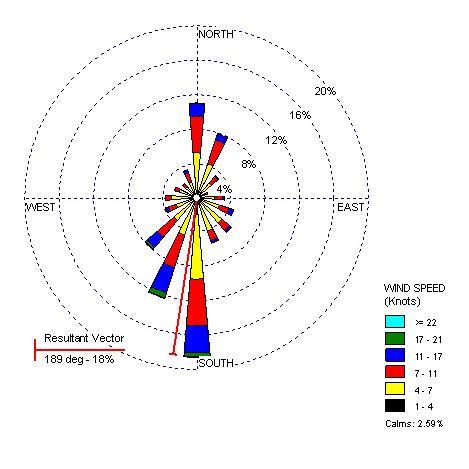
On a wind rose the length of the vectors shows the percentage of time the wind blew in that direction. This is where I found my image: http://www.climate.washington.edu/windrose/Seattle-WindRose.jpg
Climograph


A climograph is a graphical depiction of the monthly or yearly precipitation and temperature conditions for a location. This is where I found my image.